
How a podcast changed the way I train — and why I built a platform so others can find that world faster than I did.
I started Brazilian Jiu-Jitsu in 2008. I trained for a while, stopped, and came back in 2021. Like most beginners returning to the mat, I was collecting steps, not building understanding — grab here, step there, do technique X. I couldn't see the ideas behind the moves.
Then an instructor at Gracie Academy Berlin shared a podcast called BJJ Mental Models. That was the moment something clicked. It showed me that you can study Jiu-Jitsu off the mat — and that time actually makes you better when you do train.
That opened a whole world: articles, interviews, match breakdowns, instructionals, training notes. The problem? It took me a long time to find it. So I built something to help others discover it faster.
These are the resources shaping the way I learn Jiu-Jitsu — and I want them to be easy to find.
The platform
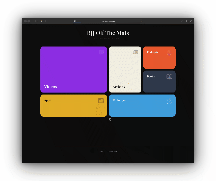
BJJ Off The Mats organizes learning resources into six categories: Technique, Podcasts, Articles, Videos, Books, and Apps. The core principle is simple — nothing gets published unless I've personally consumed it. This isn't a scraper or an aggregator. It's a hand-picked collection from my own learning journey.
The architecture is intentionally minimal. A homepage calls an API, gets data, and displays it with a strong visual identity. The focus is entirely on curation and navigation experience.
BJJ Off The Mats ⇒ Supabase Edge Functions ⇒ Raindrop.io API ⇒ Dynamic UI
Technical decisions worth explaining
No CMS — just bookmarks
One of the most important decisions was not building a content management system. Instead, I use Raindrop.io — a bookmark manager — as the content source. When I find something worth sharing, I save it with a category tag. The platform fetches those bookmarks via their API and renders them.
This separation of concerns is the right call for a project like this. I can curate from my phone or browser without touching code, there are no database migrations when I add a new resource, and Raindrop already handles organization and search. The frontend just consumes what's there.
A proxy layer — not just for security
The frontend doesn't call Raindrop directly. It calls Supabase Edge Functions, which act as a proxy. This matters for a few reasons beyond just keeping the API key off the client:
- Rate limiting — Each IP is capped at 30 requests per minute, protecting the upstream API from abuse.
- Input validation — Category IDs must be positive integers. Invalid requests are rejected before anything reaches Raindrop.
- XSS protection — URLs that don't start with
http://orhttps://are filtered out before reaching the client. - Payload filtering — Raindrop returns a lot of data. The proxy strips responses down to just title, domain, excerpt, and link.
Security matters even for small projects. Rate limiting, input validation, and XSS filtering are low-effort and high-return. They don't take long to implement, and they prevent headaches later.
Client-side caching
Collection data is cached in localStorage with a one-hour TTL. Most visitors don't need real-time data — if I added a resource an hour ago, they'll see it soon enough. This keeps API calls low and the experience fast on repeat visits.
Dynamic category ordering
The homepage uses a bento grid — differently-sized boxes that create visual hierarchy. Rather than hardcoding which category gets the largest slot, the grid sorts dynamically by content count. The category with the most resources gets the most visual prominence. As I add content over time, the layout adapts automatically.
The voting system
Users can like resources they find valuable. The interaction uses optimistic UI updates — click the heart, see the filled icon immediately, sync to the database in the background. If the write fails, the vote is lost silently: an acceptable trade-off for a non-critical feature.
Votes are stored in Supabase with an upsert pattern — increment if the resource exists, create a new record if not — handled atomically by a PostgreSQL function to avoid race conditions. On the client side, voted URLs are stored in localStorage to prevent duplicate votes. Not fraud-proof, but good enough for a signal.
Newsletter subscription
The footer has a subscription form. When someone signs up, their email is stored in a Supabase table with a unique constraint — if they try to subscribe twice, the database rejects the duplicate silently and they still see a success message. No need to tell them they're already in.
The subscription state is also stored in localStorage, so returning visitors see a visual indicator that they've already signed up. A small detail, but it avoids making people feel like their action didn't stick.
Analytics and SEO
The site uses Google Analytics 4 for basic traffic insights. Since it's a single-page application, page views are tracked manually on route changes — without this, only the initial page load would ever be counted, which makes the data nearly useless.
For SEO, the basics are covered: Open Graph and Twitter Card meta tags for social sharing previews, a sitemap.xml listing all pages, a robots.txt allowing crawling, and page titles that update dynamically based on the current view. Outbound resource links also include a UTM parameter (?utm_source=bjjoffthemats.com), so referral traffic shows up in destination analytics — useful for eventually understanding which content is driving real engagement elsewhere.
How AI fit into the process
I used AI throughout — but not generically. Each tool had a distinct role at a specific stage of the process:
| Tool | Role |
|---|---|
| ChatGPT | Initial brainstorming. Exploring bookmark tool options. Comparing infrastructure trade-offs before committing to a stack. |
| Gemini | Layout and visual identity exploration. Naming research. Conceptual refinement of the bento grid approach. |
| Lovable | Implementation. Translating described features into working code, component structure, and deployment configuration. |
Switching between tools intentionally was a lesson in itself. The question isn't "which AI to use" — it's knowing at which moment of the process each one delivers the most. Lovable was excellent for consolidating a feature once I already knew what I wanted. It was the wrong tool for the earlier, more open-ended thinking.
The AI was a force multiplier. Not a replacement for understanding what I was building — I still made every architectural decision, reviewed generated code carefully, and wrote the Edge Functions with explicit attention to validation and error handling.
Design choices
Dark theme. Playfair Display for headings — a serif that feels editorial. Inter for body text. Each category has its own accent color that takes over the page background when you're browsing that section, so you always know where you are.
The bento grid collapses to a single column on mobile. The UI gets out of the way — homepage shows categories, click a category and see resources, click a resource and go to the source. No sidebars, no friction between the user and the content.
What I actually learned
- Viabilizing an idea end-to-end in under 8 hours changes how you think about scope
- Not building a CMS was the right call — using external services as infrastructure is underrated on side projects
- Switching between AI tools intentionally, rather than defaulting to one, extracts more value from each
- Security details are low-effort and high-return even at this scale
- Optimistic UI updates are one of the easiest ways to make an interface feel fast and alive
- SPAs need manual page view tracking — GA4 out of the box only sees the first load
- UTM parameters on outbound links turn a one-way content site into something you can actually learn from
- Information architecture — how to display metadata clearly and beautifully — was the hardest and most rewarding part
This project didn't just teach me how to build an application. Shipping something real, with a clear identity and an actual user in mind, sharpened how I think and create. That's the part that carries over into professional work.
What's next
The site is live and doing its job. Things I'm thinking about: search across all categories, a way for users to suggest resources for curation, surfacing the vote data so the community can see what's most valued, and expanding into new areas like competition prep or the mental game.
But the core principle stays the same. Only content I've personally consumed gets in. That constraint is what makes it worth building at all.
The platform is live at bjjoffthemats.com. If you train and you've found resources that changed the way you see the sport, I'd genuinely like to hear about them.
Oss.